AP1 - Project 2
Jenn Mcknight
For this project, we were to pick a fruit or vegetable and create a drink and its packaging based on that food, as well as a digital marketing campaign. I chose to do kiwifruit because of it's variety in visual metaphors and layers of content to draw on.
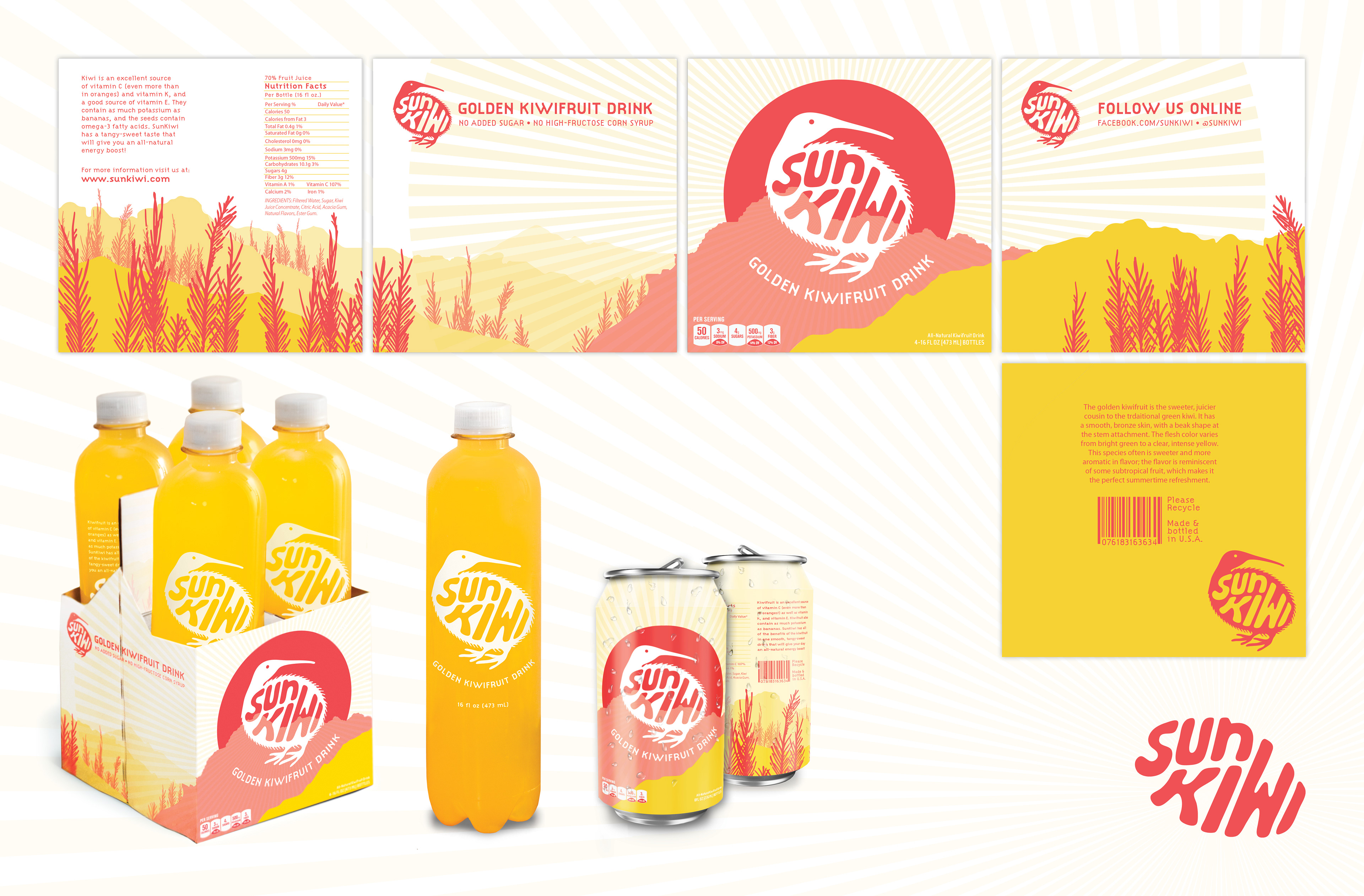
For the bottle itself, I wanted to keep it simple and clean. My variety of kiwi is the Golden Kiwi, which is bright yellow. I used the fruit drink itself as a background color. But for the outside packaging I wanted it to have more of a punch; something that would catch your eye in the grocery store.
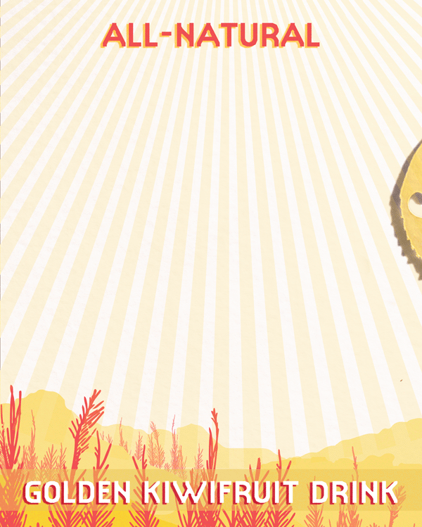
The outer packaging on the carrier and the can are based on the New Zealand landscape, and the trees are actually feathers from the Kiwi Bird.
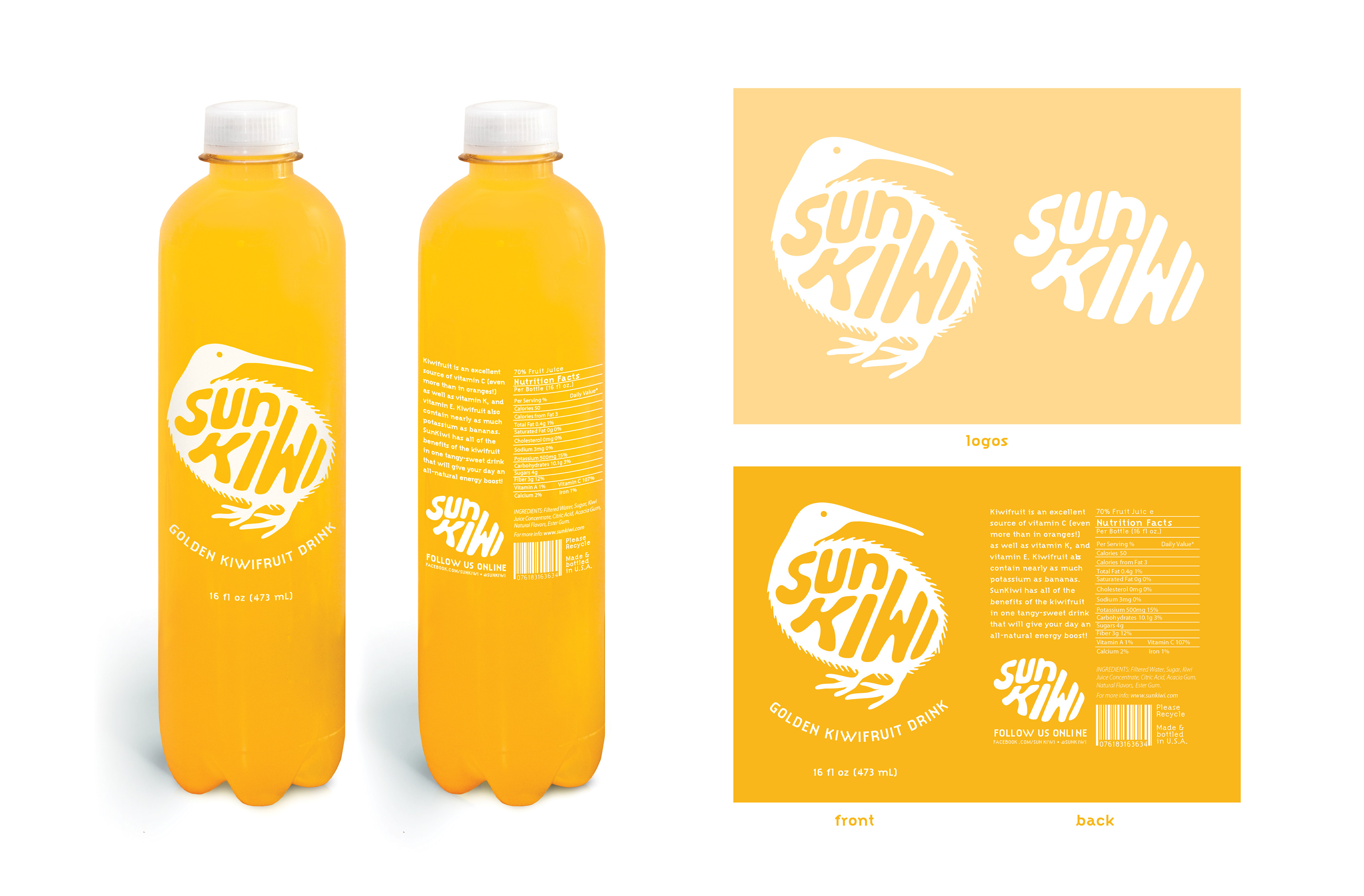
My logo is the Kiwi Bird as well. It is meant to be playful and fun.
For my digital campaign for this drink, I thought of my own experiences with online advertising. I use Adblock, which renders almost all ads invisible when I browse the interenet. However, I do see ads on Pinterest because they are built into the content of the website, and are responsive to your scrolling. I always stop and look at them, and drag the screen up and down to watch them animate. I chose to use this format for two of my ads because of this; dancing across the Pinterest tile to catch your eye.


I also chose to do an additional leaderboard ad, because they are so common.