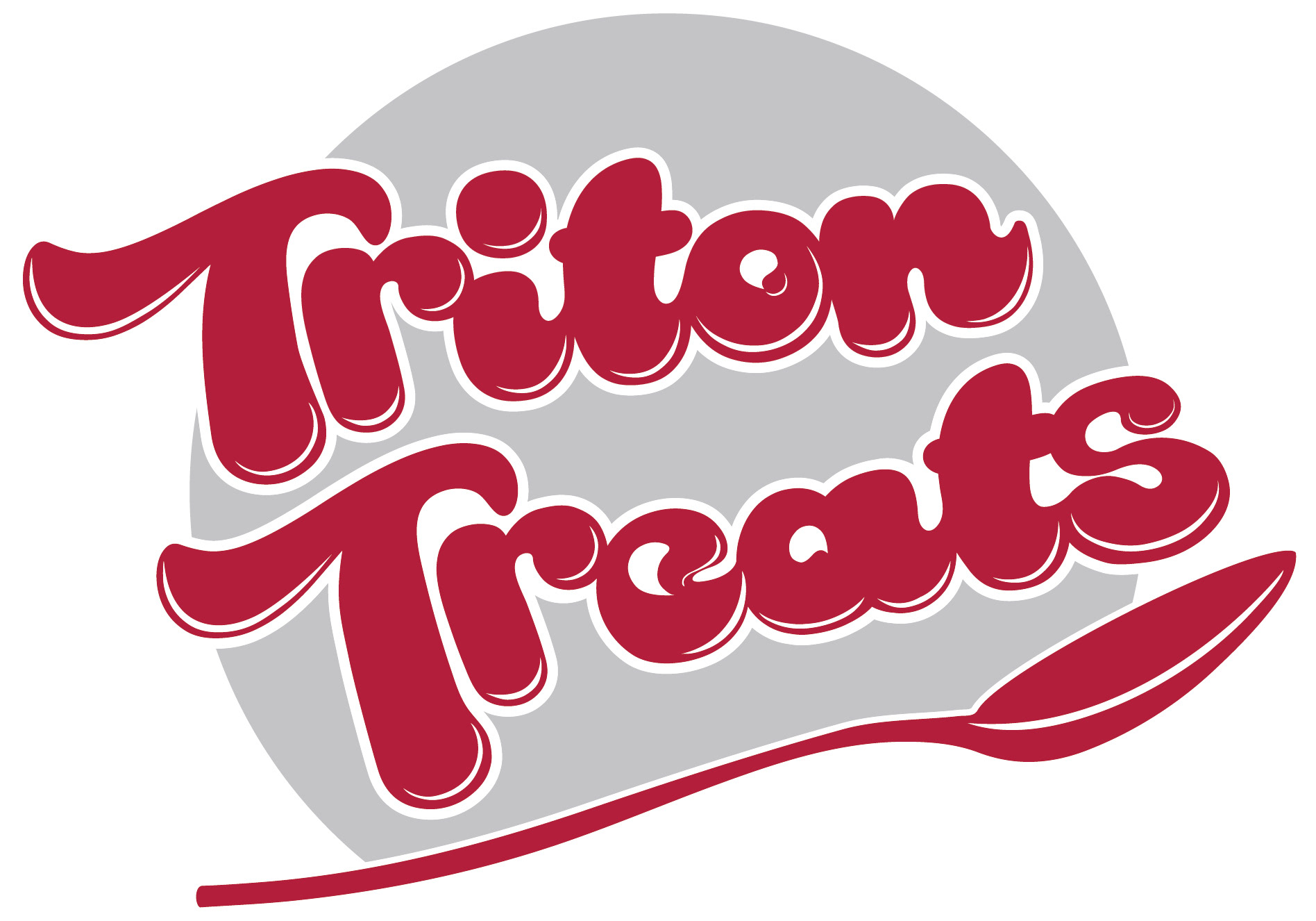
This is the logo I submitted to the contest. I did not want the circle background to look like a sun, so I went with the ever-present UMSL color scheme of grey and UMSL maroony-red.
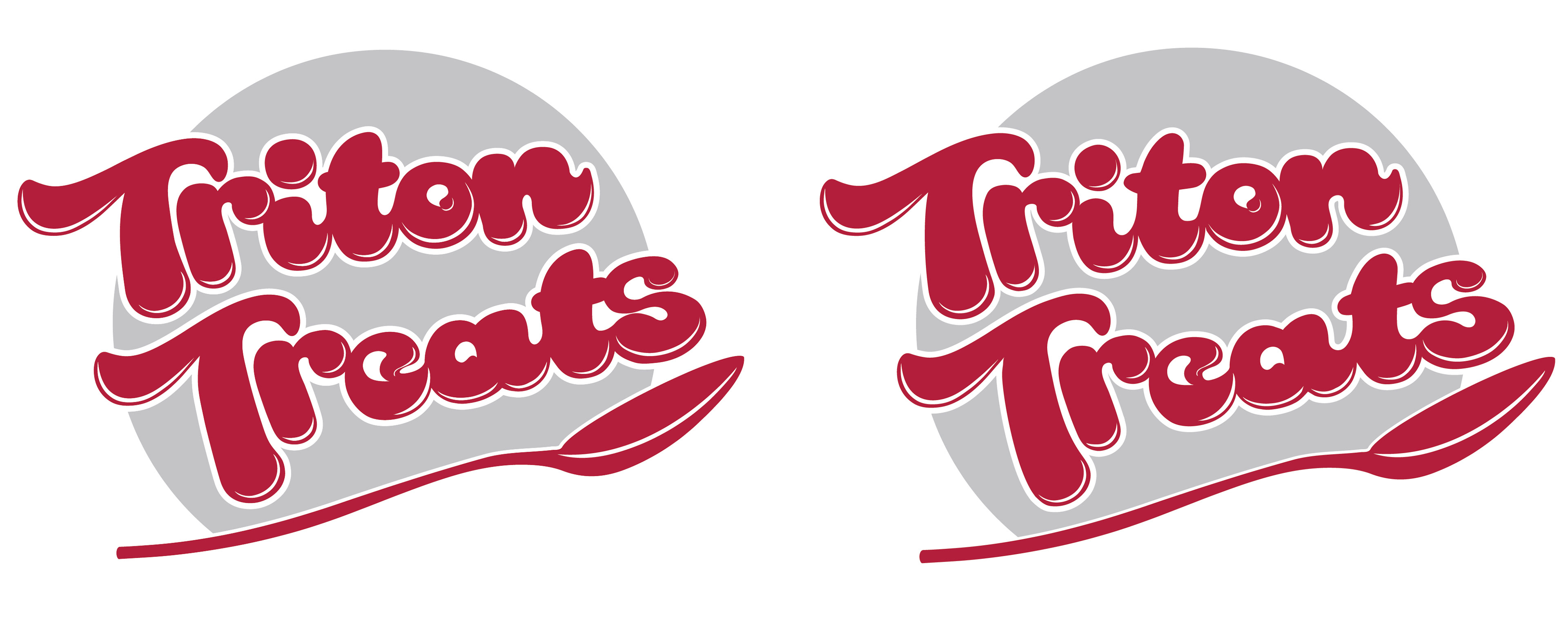
After I was chosen as the contest winner, UMSL's graphic design department for Sodexo came back to me and asked if I could give the logo a bit of weight loss surgery. The typeface I used was a frankenfont of two different faces, Rakoon & Kingthings Lickorishe. Particular mind was payed to the T's & A's.
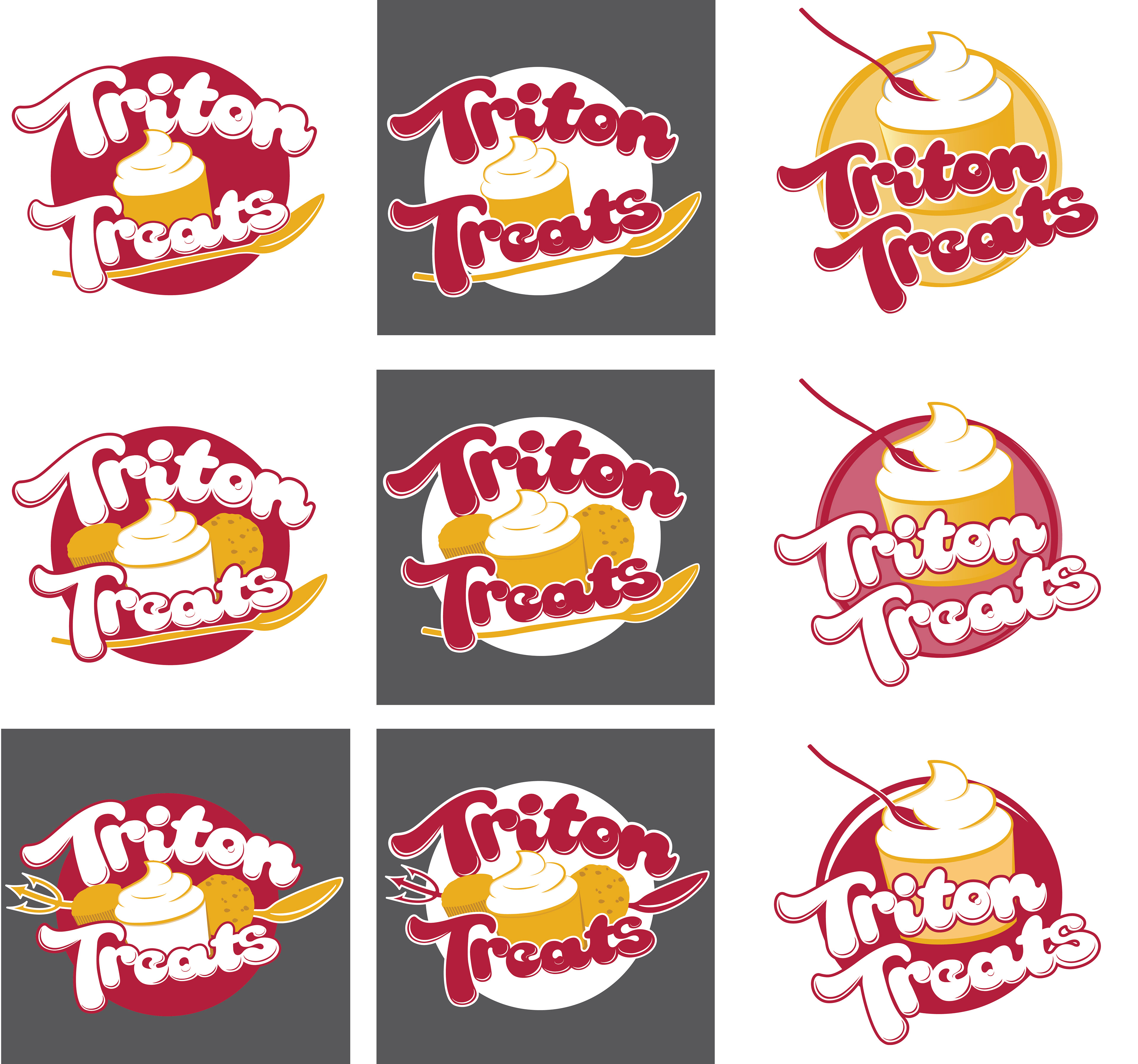
After slimming it down, they also asked that I make it a bit more fun. Triton Treats is a frozen yogurt shop and bakery in the UMSL MSC, and they wanted the logo to convey the types of goods that could be bought there. These are just a few of the versions out of dozens we went through.

This and the one below are the final logos. The UMSL team added the wording at the top and put it in the larger circle. This is what will be seen in the shop itself once it opens February 2015.
